You said you feel like the website doesn’t reflect the project as it is today, but I think this new version is even less reflective of what Tari actually is. The autonomous payments angle is front and center, and yet we don’t even have a working L2 for those agentic payments yet (sorry, no, this isn’t going to work on the L1).
This is probably the most common critique people have made about Tari—the marketing all made it sound like the Ootle was here and ready, but it isn’t.
This just leans way too hard into something that isn’t here, isn’t happening (yet), and limits Tari’s appeal to a smaller subset of users/investors.
Instead, I’d highlight the reasons why we think Tari will be a great network for agentic payments—the throughput/scalability & low fees of the L2, default privacy, mineable PoW, decentralization/censorship resistance. Make that stuff front and center, then highlight that it also makes Tari great for the upcoming agentic economy.
These are areas where Tari can actually go head to head with competing projects. Just saying “we’re building a network for agentic payments” is old and boring now. That was exciting 6-8 mo ago, but it’s the common line with virtually every single cryptocurrency project today. Highlight what makes Tari different/better instead of being the same.
Agree on directing people towards docs and community, but it can’t be at the expense of miners and node operators. There’s significant overlap between builders/community members and miners/node operators, and the latter category is literally essential for the network to function. Increasing those metrics should always be a priority. More nodes, more individual miners = healthier/more secure network with a larger userbase = more builders choose to build on Tari. This is what worked for BTC, it’s what worked for ETH, it’s a proven strategy - we don’t need a new one we need to figure out how to execute what actually works.
But yes, let’s definitely update that navbar and make the technical documentation/community links more prominent/easier to find! (why are the only links to the socials hidden all the way in the footer???  )
)
Maybe replace “Airdrop” with “Documentation”?
Not really a fan of the redesign choices (I know you repeatedly emphasized you are not a designer, so these are more just general notes I suppose). Tari has some of, if not the most, beautiful design of any crypto project I’ve ever been involved in. It’s the number one thing Tari Labs did right and, by far, the single greatest generator of positive community feedback (Tari Universe especially—which is why we shouldn’t be hiding or pivoting away from that). It seems like we’re pivoting away from the only thing that has actually worked to attempt something unproven. We can do multiple things at once!
I think less is more with the “redesign.” We have a messaging issue, not a design issue. The website doesn’t need a total facelift. Change some text, update the navbar, remove some of the clutter on the homepage and replace it with the new messaging,
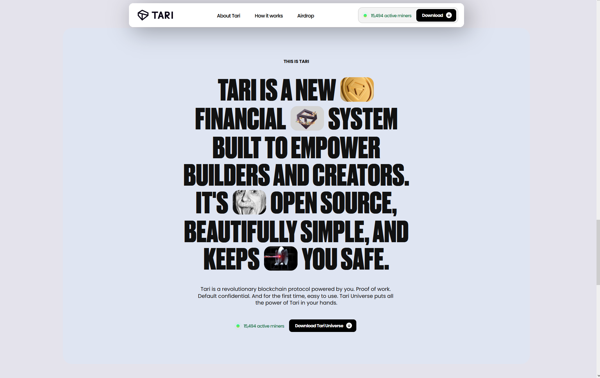
This is a great starting point, for example. But it’s hidden halfway down the page above the FAQ and below a bunch of old social media posts where no one ever sees it! Add in the stuff about agentic payments, move this to the top of the page in place of the “turn your computer into a money making machine” stuff, and you’ve hit on everything you wanted to (as a start). The foundation is there, it just needs some tweaking.